
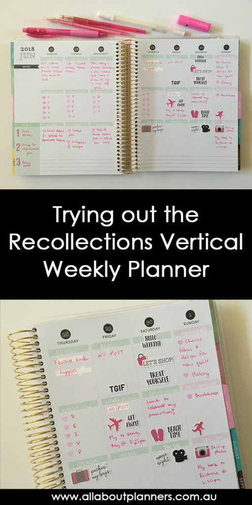
Trying out the Recollections Vertical Weekly Planner
So I know I’ve said on numerous occasions that I hate vertical planners.. but I didn’t have much to plan this week so opted for a decorative spread… in a vertical planner.
Before the Pen
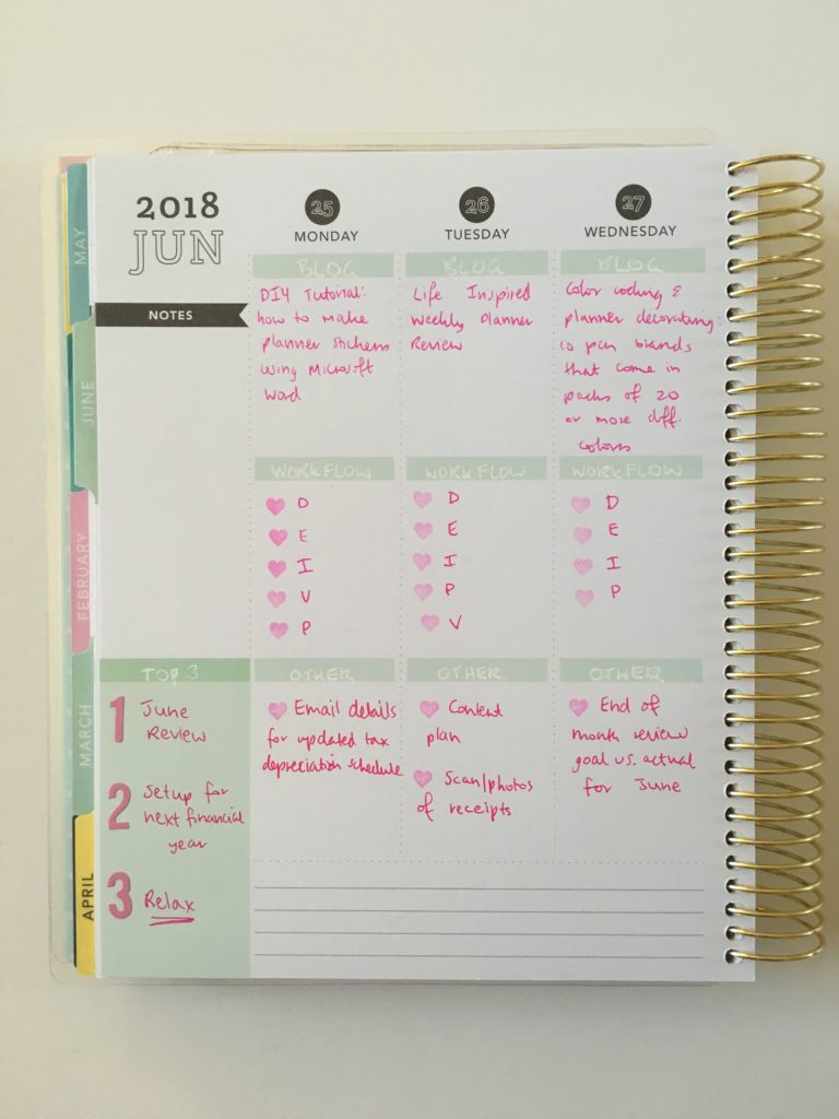
The recollections planner reminds me of a cross between the Erin Condren layout and colors similar to the style of Plum Paper. I’m not someone that normally likes pastel colors however this planner is the one exception I’ve found so far (even the yellow is nice!)
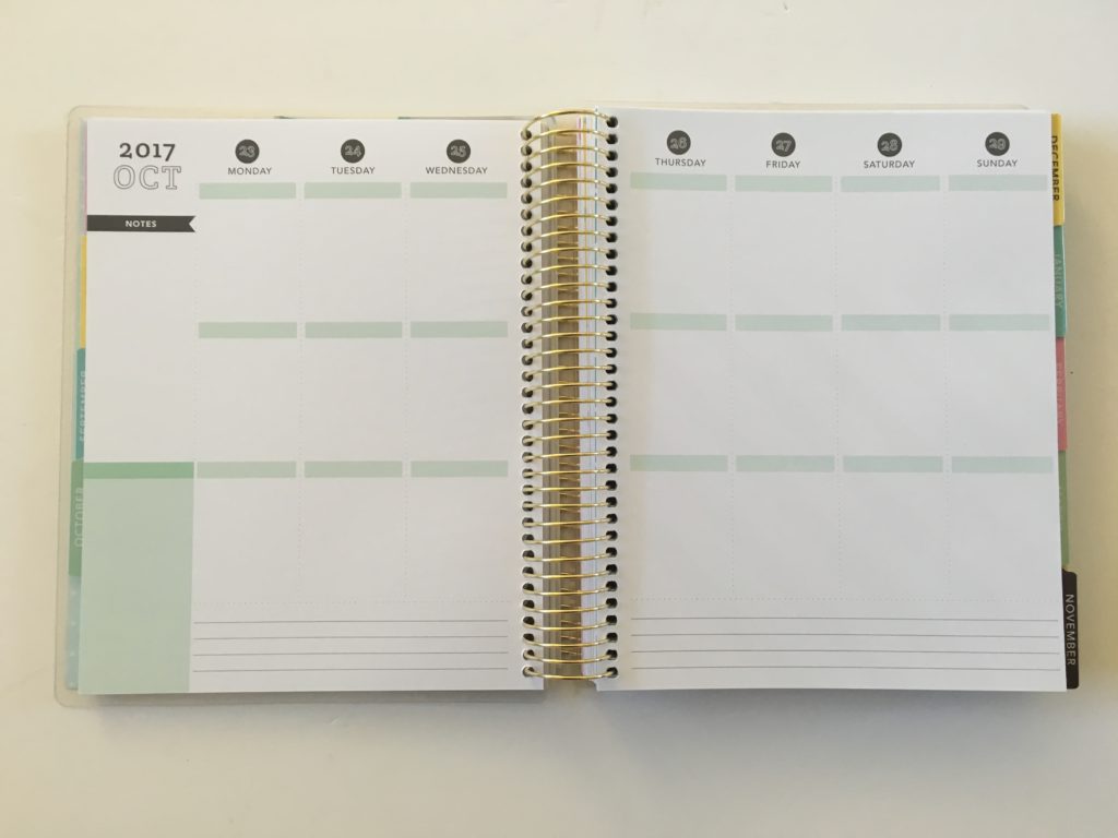
See my review of the planner in this post
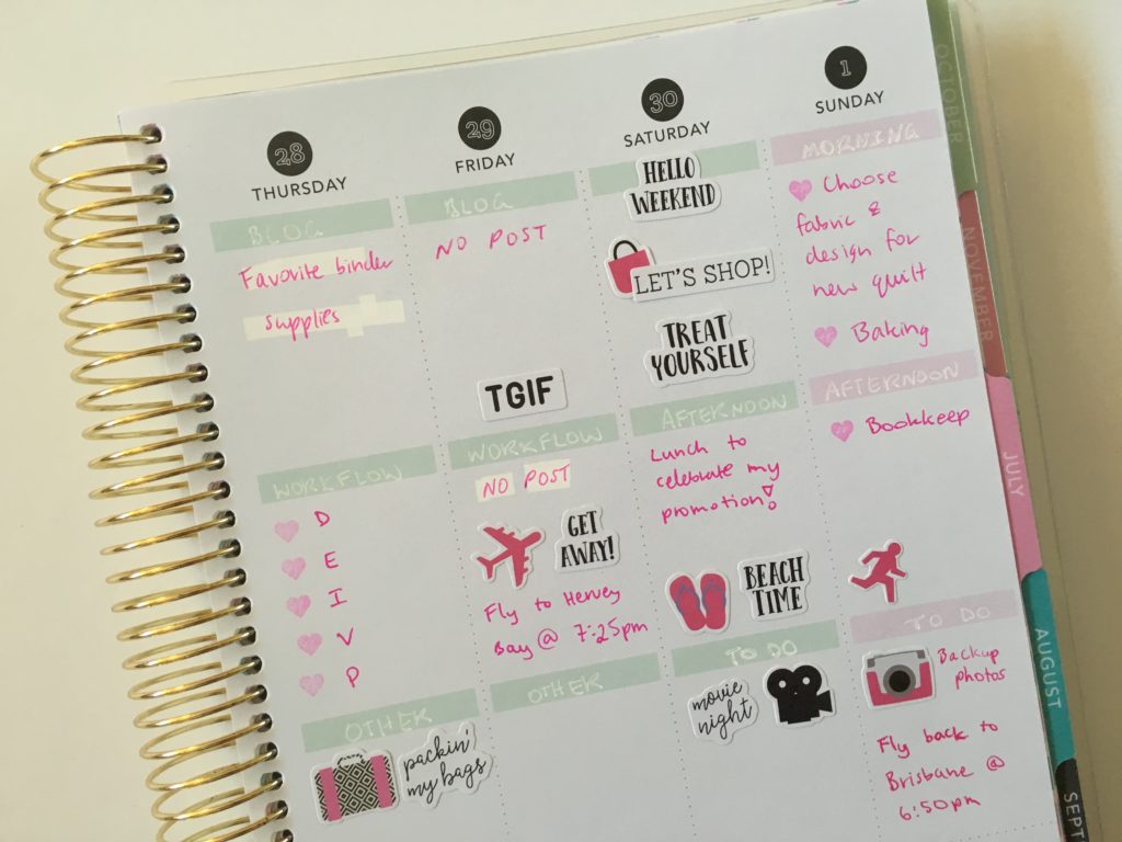
After the Pen
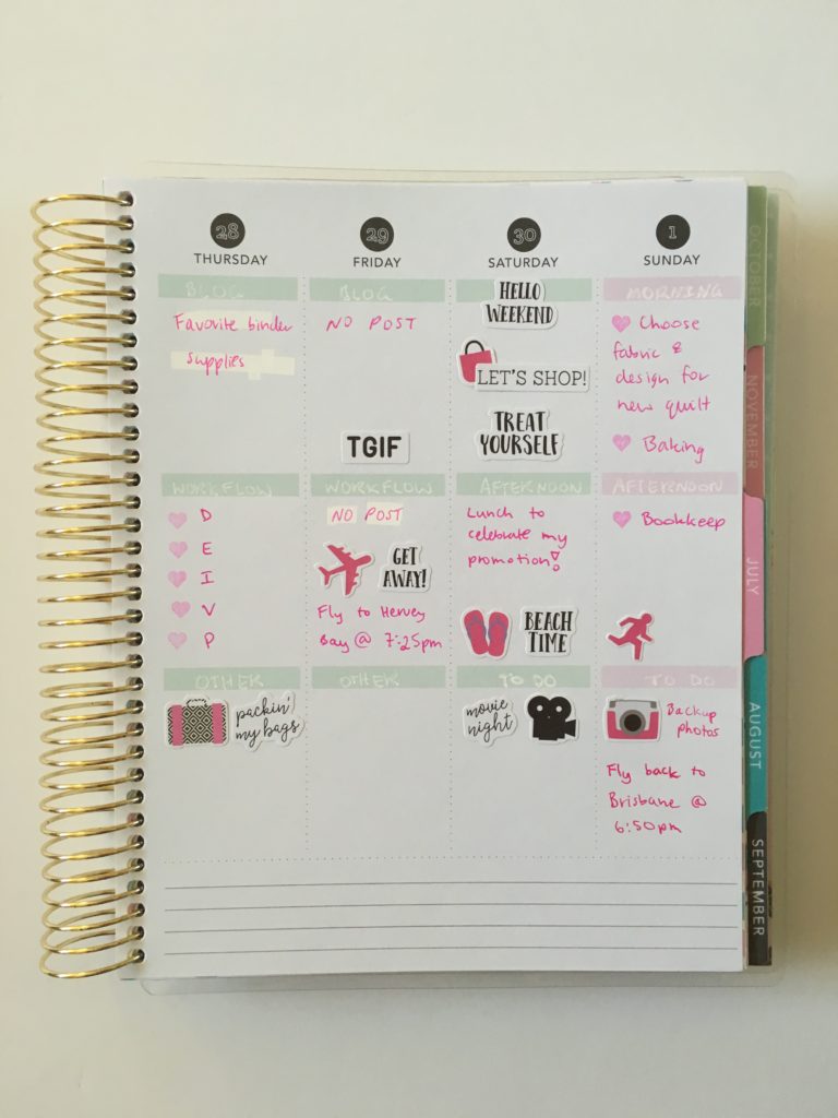
Since I didn’t have much to plan I decided to do something I don’t normally do – use one color for everything.
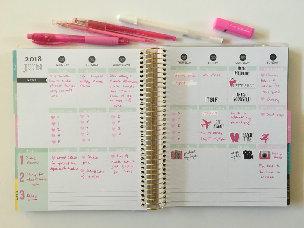
It would’ve looked nicer if the entire week was pink rather than the mint but oh well.
It probably doesn’t show very well in the photos but I attempted to do an ombre layout with light pink at the top (BIC BU3 Grip 1.0 pen), middle shade of pink in the middle and darker shade of pink at the bottom.
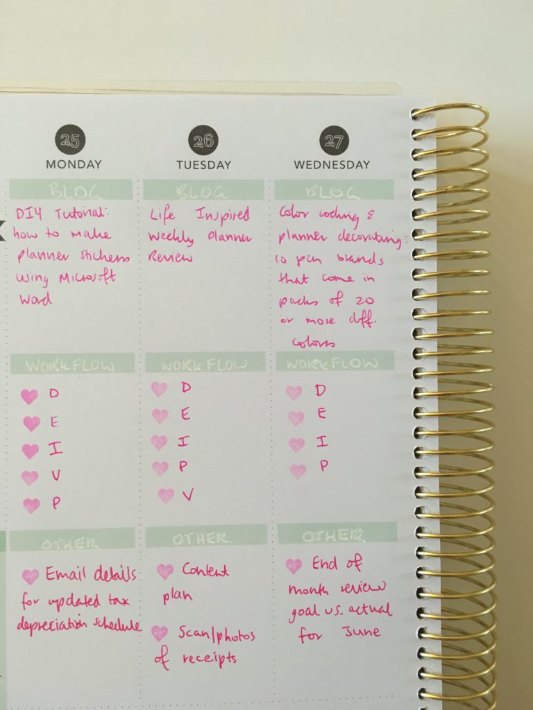
Rather than using a header sticker, I used the Sakura Gelly Roll 08 white pen for headings. I originally used the Pilot PopLol in white but the ink wasn’t very bold and didn’t show very well against the mint.
I don’t really do sticker decorating but did a bit this week with the Carpe Diem stickers. I love that brands’ rainbow sticker books!
Supplies Used
- BIC BU3 Grip 1.0 pen
- Pilot Frixion erasable heart stamp (number 51)
- Color Diamond pens
- Sakura Gelly Roll 08 white pen
- Carpe Diem Sticker tablet sticker book (the 1 to 3 numbers)
- Carpe Diem Sticker tablet calendar book (decorative stickers)
I only used the Color Diamond pens as they came in multiple shades of pink. I don’t recommend the color diamond pens. I bought them off Amazon and they’d either been sitting in a warehouse for a long time or something happened in transit, but some of the pens in the pack did that thing where the pen ‘sweats’ or the other extreme where the pen was dried out and no matter what I tried I couldn’t revive it. I ended up getting a refund for them.
Would I Use this planner again
Maybe. If I wanted to do a decorative spread vertical layouts seem best for that as there isn’t much room to write and most stickers are designed for vertical planners.
Past weekly spreads
- Using Erin Condren Size Planner Stickers in MAMBI Classic Happy Planner
- Planning the week using stamps (MAMBI, Carpe Diem & Creative Devotion)
Planning tips
- 10 ways to plan using sticky notes
- Finding planner peace: 18 things to check before choosing a planner
- Setting up a new planner: 70 Tasks to add
If you want to try your own version of the 52 planners in 52 weeks challenge, this printable bundle of 52 different 1 page weekly planners (you can mix and match to create 2 page spreads if you prefer), is available in my Etsy shop and online store.
Found this post helpful? Pin it!


I kind of like having the headers in a different color. It sets off the sections and makes it easy to look where you need to look. Due to working full time and part time PhD schoolwork, I need 1 page per day style, but if I was just doing one or the other the vertical week would be fine for me. I need to be able to have meetings and due dates/times show at different times of the day.
My preference is towards what you have done here. More planning, less decoration, but that is out of necessity and time.