So if you’ve been following my weekly spreads you’ll notice I tend to stick to either a minimalist black weekly spread design with colored pens or the reverse – a rainbow design with black pen. I love anything rainbow so much so that a reader emailed me asking if I ever get bored sticking to the same ‘theme’ when planning.
Short answer: no!
Some people like doing no white space weekly spreads, some like no color at all. I like rainbow printables, pens, highlighters etc.
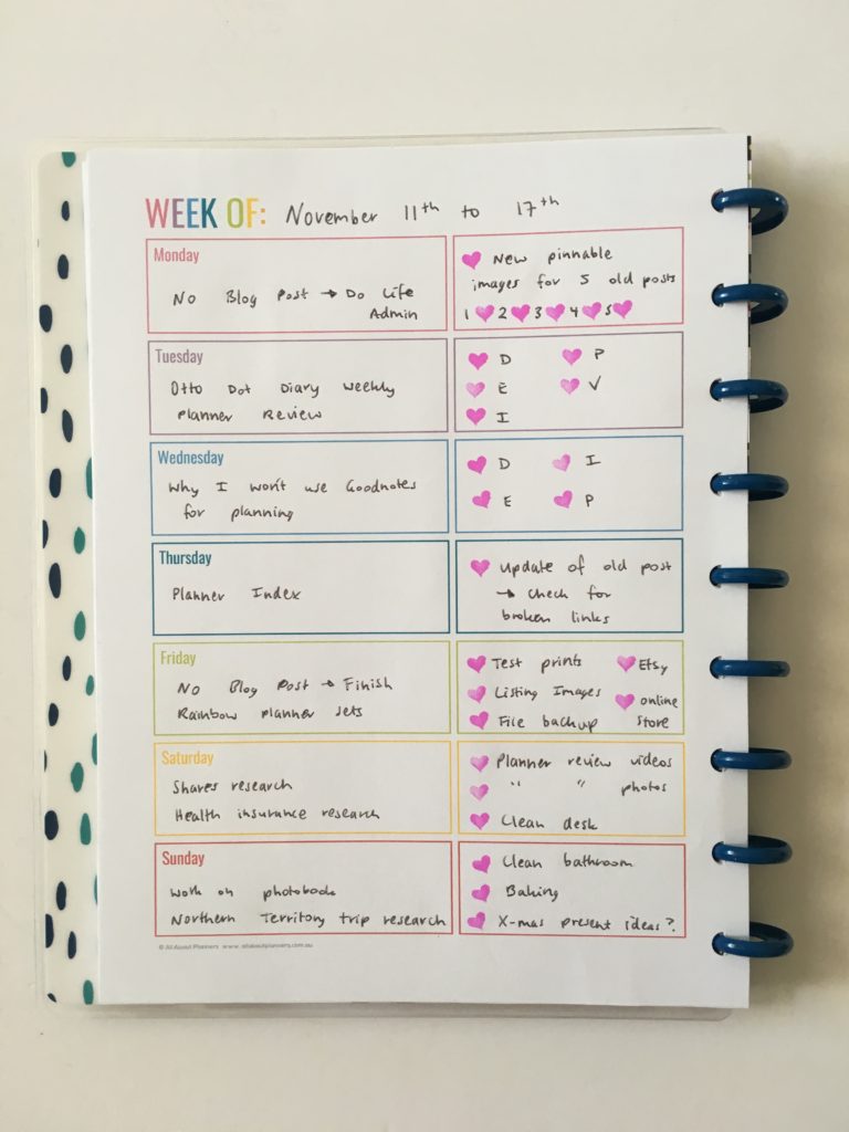
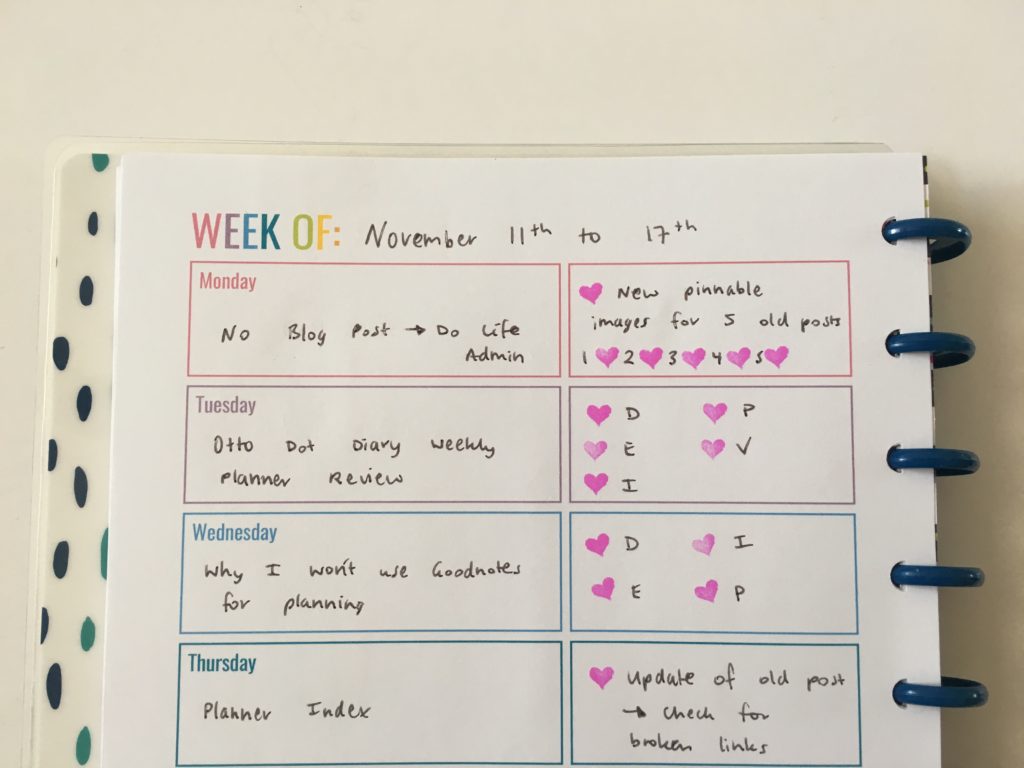
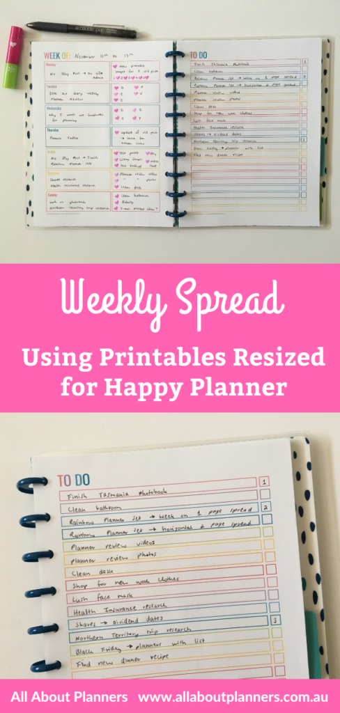
This Week’s Spread
I resized some printables I made at US letter page size down to Happy Planner classic page size (see this post for my tutorial if you want to try this).
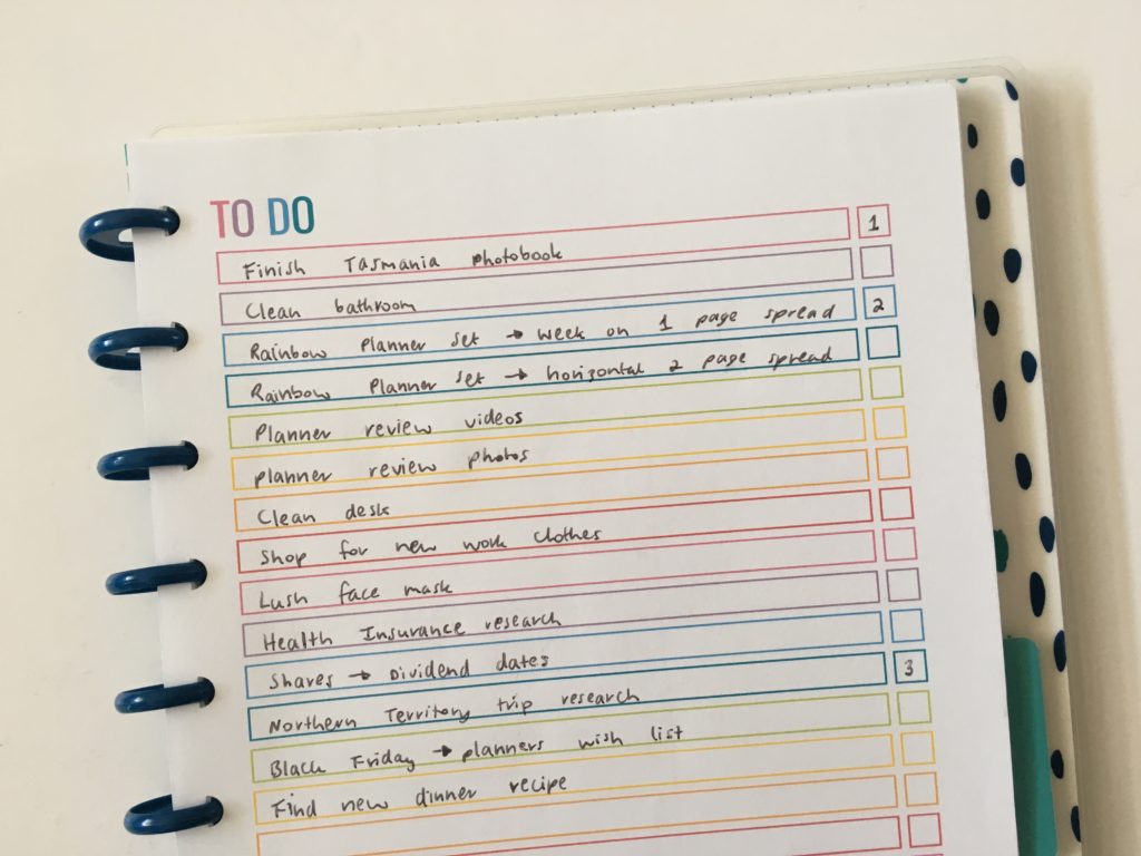
My usual layout – blogging on 1 page and checklist on the right.
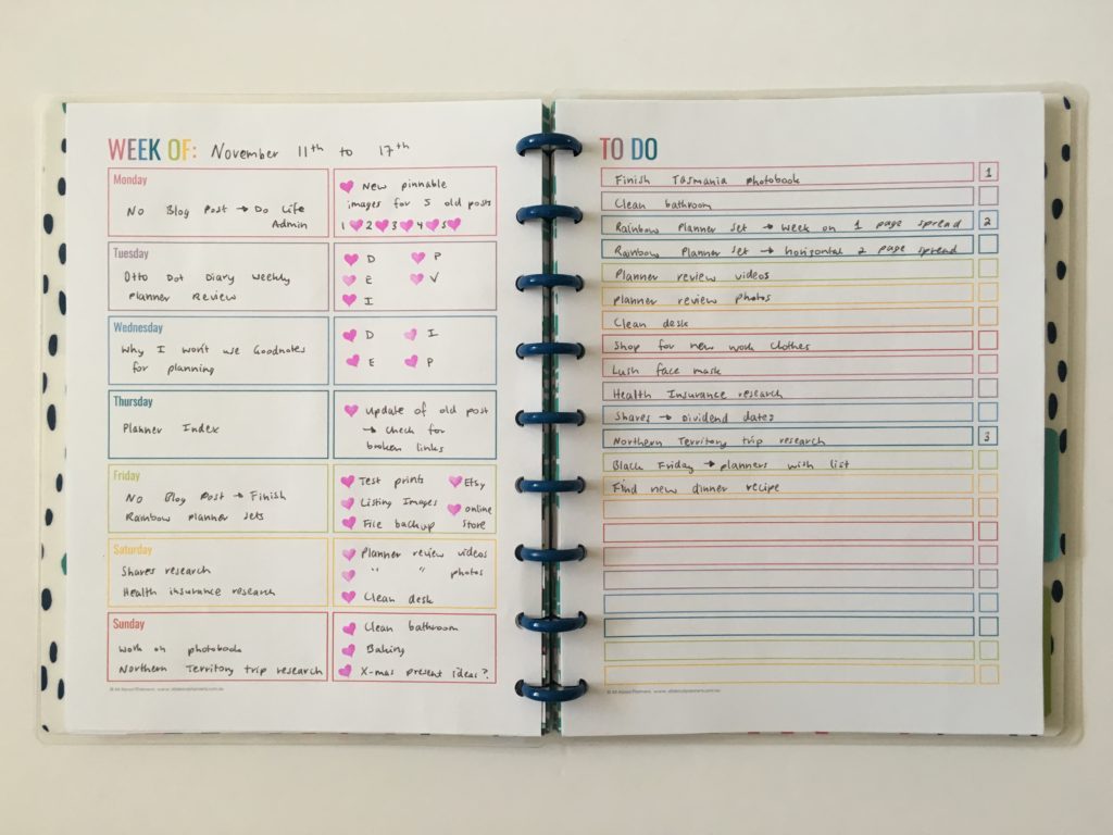
Download this checklist for free from the printables library. Existing subscribers can login to the library here.
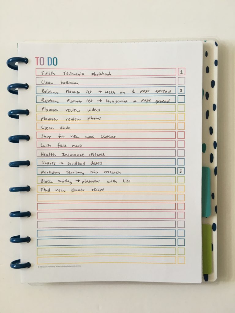
I kept the checklist simple and didn’t cluster or color code blogging and personal – I just did a brain dump then numbered my top 3.
Supplies Used
- To do List printable from the printables library (download for free here) – it’s also part of the anything lists kit
- 1 page weekly planner printable (also available in this kit in my shop)
- ParKoo erasable pen in black
- MAMBI self inking heart stamp
- MAMBI Happy Notes classic page size
Would I use this spread again?
Yes. Planning with a 1 page weekly spread in horizontal format and checklists on the other page is my all time favorite weekly planning layout. See past spreads with this layout here, here and here.
Past weekly spreads
- Keeping work and personal in the same planner plus pie chart blog planning
- Trying out the Recollections Vertical Weekly Planner
- Using the Emily Ley Weekly Plannner
Liked this post? Pin it!
I totally agree with you about using lots of color! I think it makes the page look more interesting and makes keeping track of things more fun. (I don’t always want to look at a list of doctor’s appointments and things I need to clean, etc, so using color is nice!) I love your rainbow spreads.