
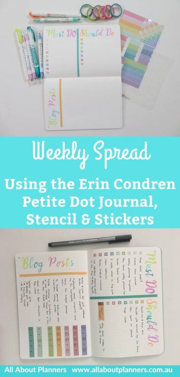
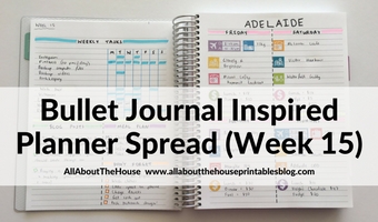
Weekly Spread in the Erin Condren Petite Dot Journal (Calligraphy Stencil and Foil Stickers)
I always use the same style of dot grid notebooks and I must admit, it’s a slightly-annoying-first-world-problem when the first few and last few pages don’t completely lay flat because of the binding. So I wanted to try this little stitched notebook from this Erin Condren Haul.
Before the Pen
In the same haul I couldn’t resist adding some Erin Condren stickers. I like the colors… but I went through my entire pen stash and couldn’t find any that were a close match. So I switched and focused on finding highlighters that were a close match. I finally came up with a combination of various brands (they’re listed at the end of this post).
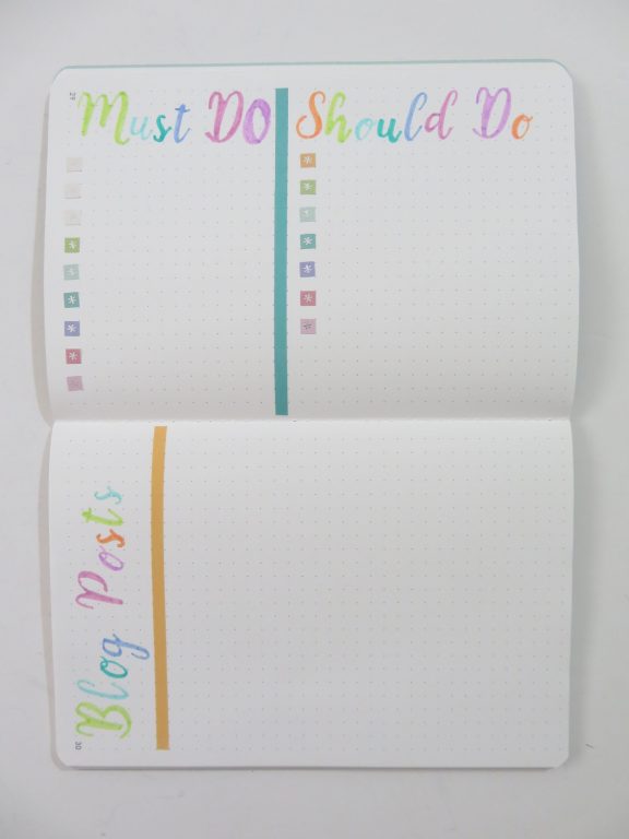
For small notebooks like these, I don’t do 2 columns vertically – too narrow! So I rotated the page landscape ways.
Related: 10 Bullet Journal Landscape Page Orientation Weekly Spreads
The dot grid spacing is slightly more than the 5mm most dot grid notebooks have (not quite 6mm but closer to 6mm than 5mm). It looks like they’ve changed the dot grid to 5mm since I purchased this notebook.
My verdict on the stencils? They’re ok but time consuming and you do need to do some manual fix ups. It took me around 15 minutes to do the letters.
Look how bendy it is – I was expecting sturdy, hard, non-bendable plastic. This just feels like a cheap quality stencil with an expensive price tag and packaging.
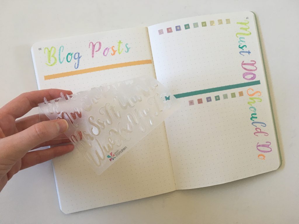
I don’t understand why some stencils are like this – with awkward gaps you have to manually join by hand to make it not look like a stencil… But then the ink pools anyway and it looks like you used a stencil.
I ended up just free-handing the o’s, the stencil o has no resemblance to a real letter o.
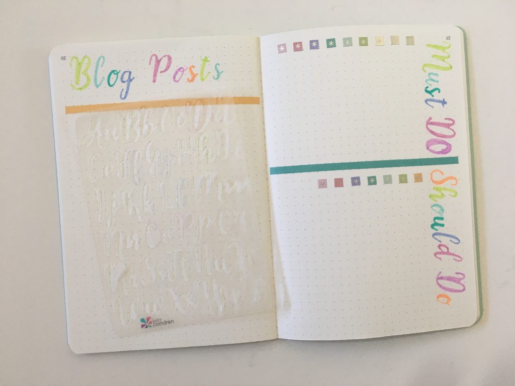
I thought about placing the stencil backing (the cardstock that has the letters printed on it that comes in the packaging), but the paper is thick enough that you can’t see through (but you can still see ghosting from highlighters, pens and even the big stickers).
After the Pen
Stencils are risky… if your hand slips, it’s obvious if you use whiteout. I was super careful and used the thinner end of a dual tip highlighter. It ended up being the perfect thickness to not require going over a second time like you would with a normal pen (or even a dual tip pen).
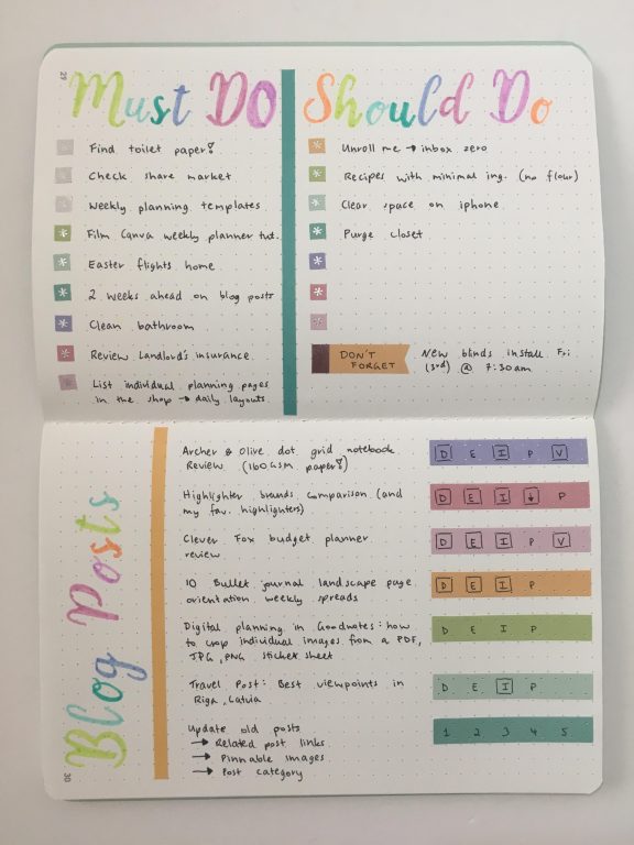
All of the stickers are from Erin Condren. They suggested using these rectangular ones vertical for lists, but I opted to flip them and use for blog post workflow instead (I drew the box if the task was complete). I like how this turned out and would use these stickers again!
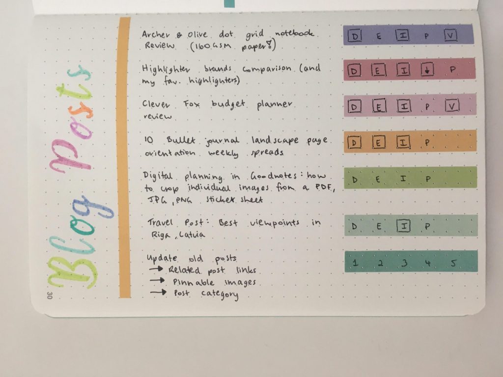
I quite like these stickers and wish they came in full sheets of just the rainbow asterisks.
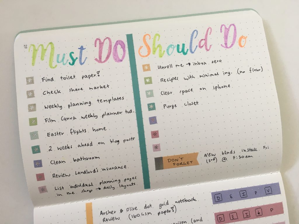
I always default to silver gold foil or glitter washi tape and while I’m sure that would’ve looked great with the silver foil stickers, I wanted to use something different. I had just gotten this washi tape (with the intention to use it in a spread with the Stabilo Boss pastel highlighters which I may still do in the future), which ended up being a close color match with the stickers.
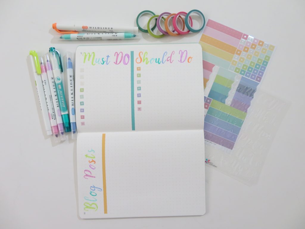
Supplies Used
- Erin Condren Petite dot journal (see the rest of my Erin Condren Haul here)
- Erin Condren calligraphy stencils
- Erin Condren Dot Grid Sticker sheet
- MIlkliner highlighters – aqua, light pink, pink / purple
- Zebra Just Fit (Dual tip) – Teal highlighter
- Zebra Mildliner (Dual Tip) – Green and Orange
- Washi Tape – Karin Joan (Studio Light) Blooming Collection (Pastel)
- Grey Pen – Staedtler Triplus Fineliner
Pros of this weekly spread
- Looks good and doesn’t require you to actually be able to do calligraphy
- Notebook is small and portable
- Pages lay flat on their own (and the page numbers sit below the dot grid)
- Love the colors
Cons of this weekly spread
- Really only works for landscape page orientation as the stencil letters are so big, and the page size is so small
- Stencils are risky… if your hand slips, it’s obvious if you use whiteout
- The paper in this notebook needs to be just a bit thicker – everything had ghosting (even the big stickers)
Would I use this notebook again?
I like the notebook and the fact that it lays flat on it’s own, as well as the affordable price tag (only $9 USD, plus there’s frequent sales nowadays that you might be able to get it even cheaper), but I wouldn’t go out of my way to do an Erin Condren order just for this notebook.
I like the stickers, but they’re over-priced ($5.50 USD for 2 sheets) for being mass produced I’d expect them to be a bit cheaper.
I like the idea of a calligraphy stencil and if the plastic was sturdier with the letters punched through properly then I’d be more likely to use this stencil.
Overall, I like the products and I like how the spread turned out, but it was time consuming. I may replicate elements in other spreads e.g. maybe just 1 calligraphy heading to save time.
If you prefer a more traditional sewn bound notebook, see my review of the Erin Condren dot grid notebook here.
Past weekly spreads
- 52 Lessons learned after trying 52 different planners in 52 weeks
- Color coding by section using the Kikki K Goals Weekly Planner
- Bullet journaling on black paper with white & gold pens
Planning tips
- 8 Ways to use highlighters for Bullet Journal Spreads
- How I use different types of pens when planning
- Which planner stickers are right for you?
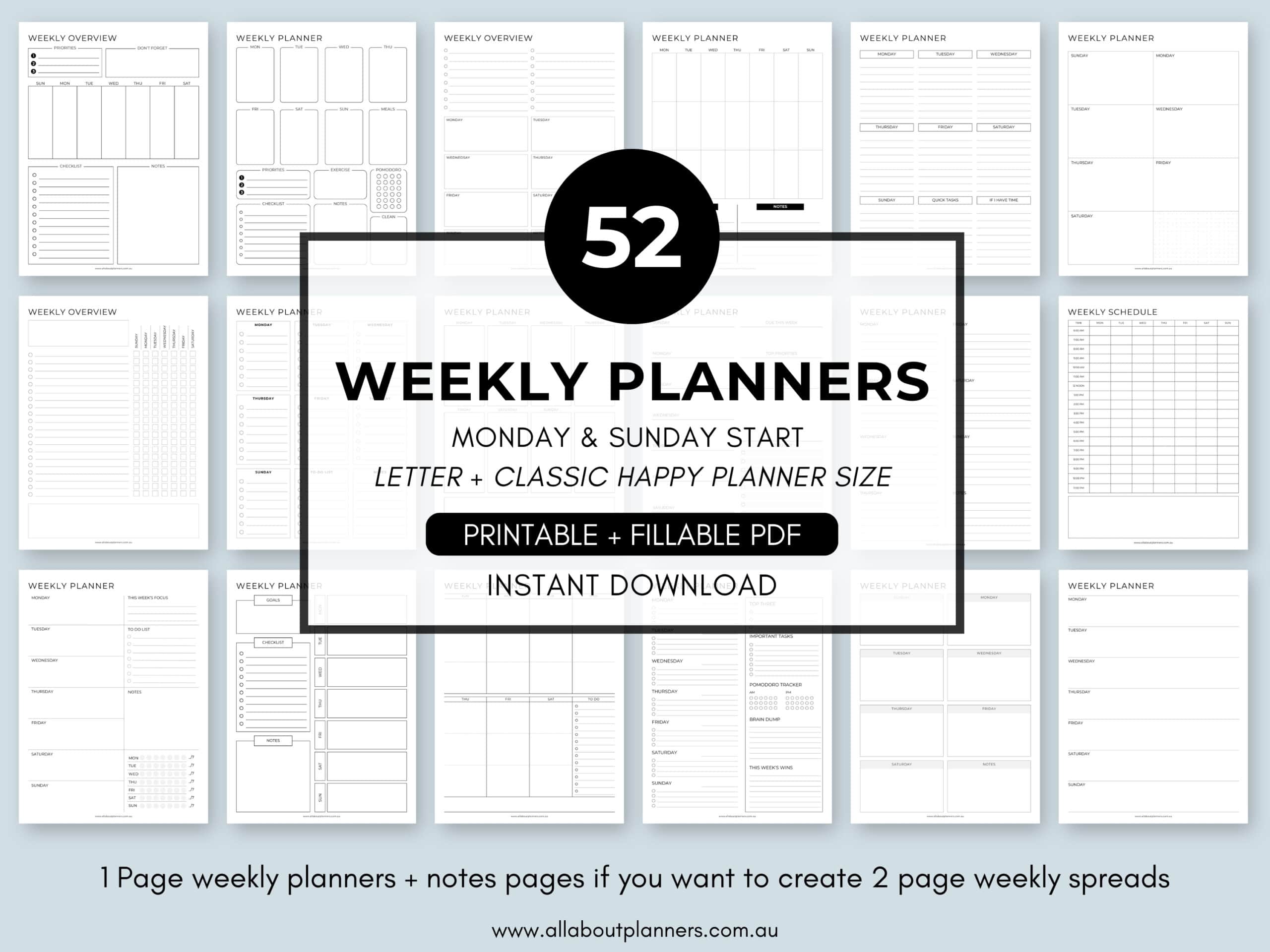
Tired of drawing up weekly spreads? This printable bundle of 52 different 1 page weekly planners (you can mix and match to create 2 page spreads if you prefer), is available in my Etsy shop and online store. It comes in US letter size and Happy Planner classic page size.
Found this post helpful? Pin it!


Which stencils can you recommitted for bullet journaling? I find a lot are cut too finely to let my pen get in the little crevices. So my finished doodle doesn’t look as good as the doodle depicted on the stencil itself.