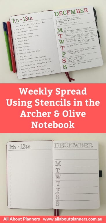
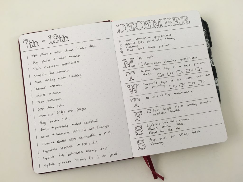
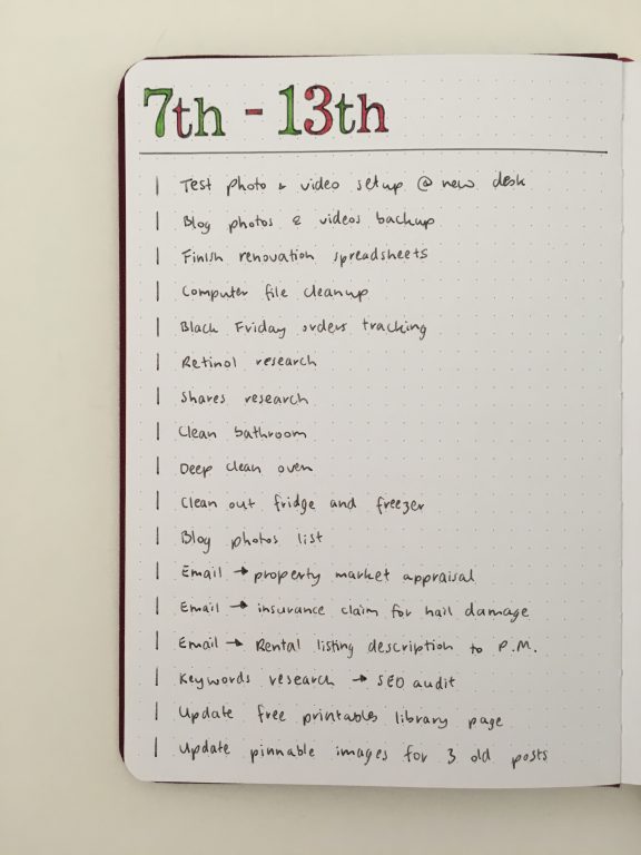
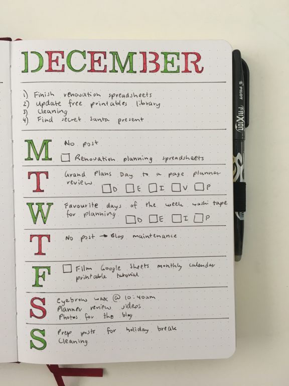
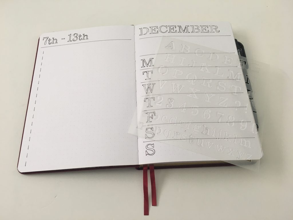
Bullet journal stencils weekly spread in the Archer and Olive Notebook
Stencils are my latest favorite planner supply. Since my handwriting always looks the same and I can’t be bothered ‘learning’ different handwriting, stencils are an easy fix!
This post contains affiliate links. If you make a purchase using my link I’ll receive a small commission in exchange for referring you.
Before the Pen
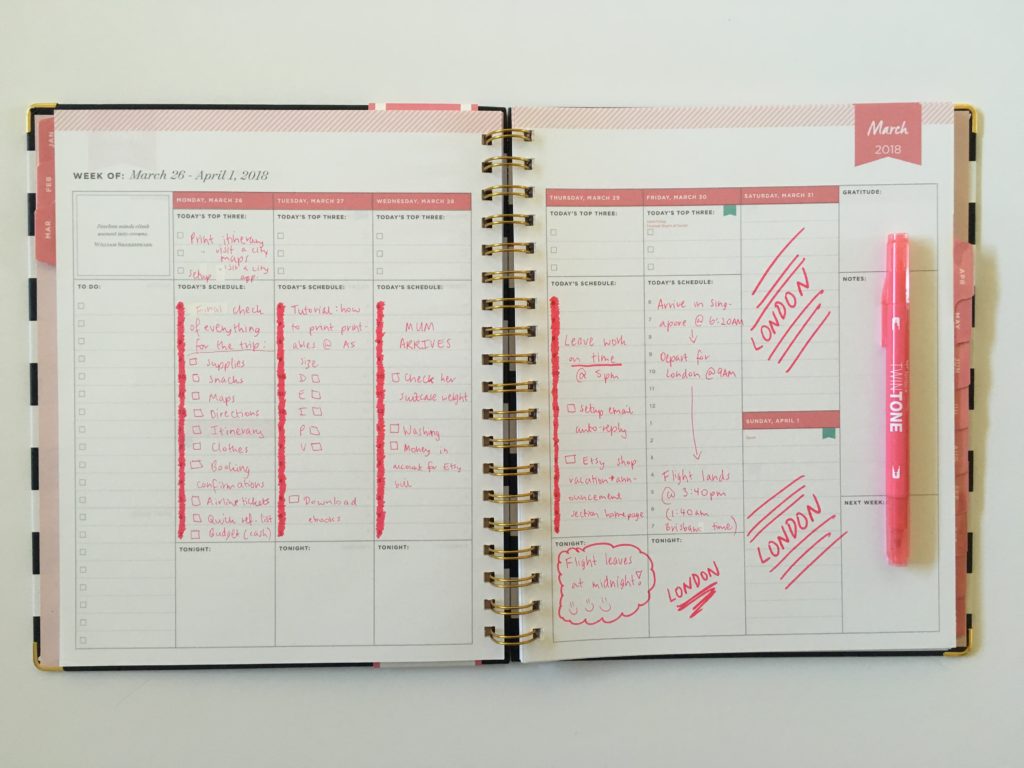
I did my usual dashboard weekly layout but this time with the days of the week on the right. I used the PA Roman Alpha stencil.
You could erase the join lines on the relevant letters (D and B) to make it look like you didn’t use a stencil but I didn’t mind it so just left it as is. I used the Frixion Erasable pen. 0.7mm pen tips are normally too fat for metal stencils but work fine with the PA stencils. It is a close fit for the lowercase letters so you may want to use a 0.3mm pen tip if you want to be more precise.
I decided to do something different with my checkboxes. I normally draw a checkbox and track the status of the task inside the checkbox. This week I made the checkbox as I progressed with the task.
I drew the right side to indicate where to write my task then used:
- Bottom line of the checkbox = task started
- Left side of the checkbox = task progressing
- Top side of the checkbox (i.e. completed box) = completed task
After the Pen
And that was the end of this week’s spread…
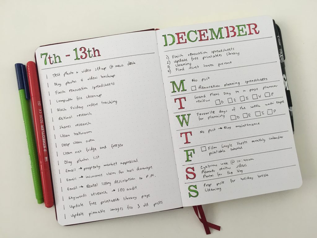
Kidding, I need some color!
I used two different Staedtler marker pens to fill in the letters. I was going to do my usual rainbow but did red and green Christmas colors instead.
I used the top box above the days of the week for priority tasks but you could use this for meal planning, school assignments due that week, work schedule etc.
I normally do my weekdays on the left page but for me it didn’t really matter which side the days of the week of the spread are. If you want to do a brain dump master to do list for the week then it would make sense to do this on the left page then carry the tasks over to the weekly spread on the right. I prefer to just work off a to do list and only allocate main tasks or appointments to specific days.
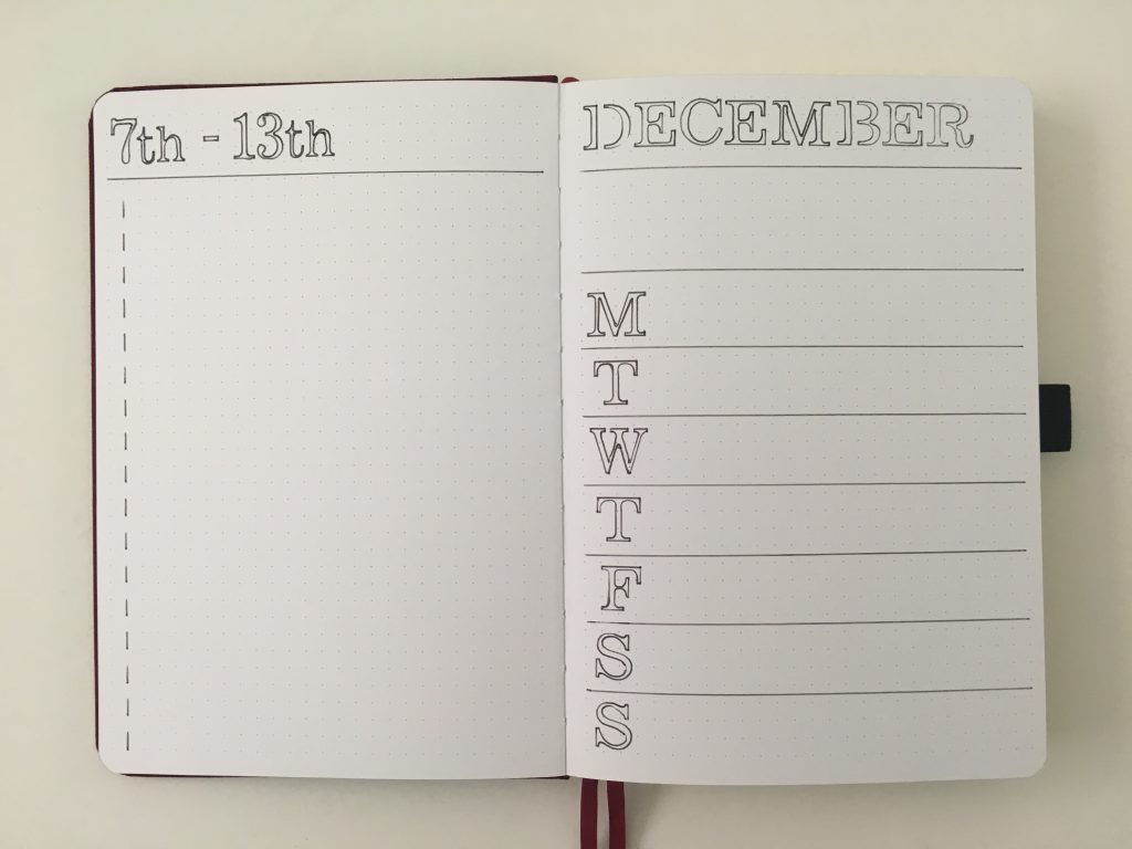
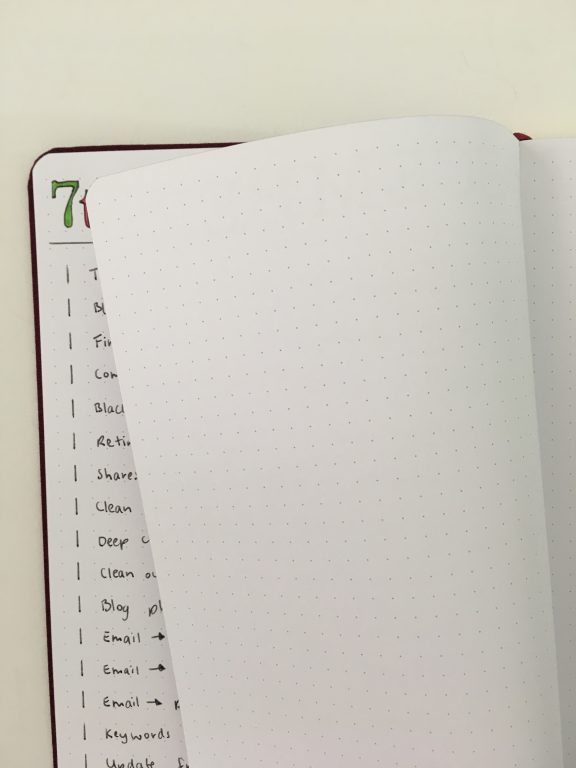
After having used the Archer and Olive for a while, I’ve noticed a mis-alignment in the dot placement on some of the pages. On one side of the spread on some of the pages, the dots are higher than the other page of the spread by about 2mm.
The paper in this notebook is thick – 160 GSM. There was no show through at all so I’m willing to forgive some miss-prints if it means better quality paper (and bright white pages). Note: the version I purchased does not have page numbers and I purchased this notebook a year ago so I’m hoping the quality may have improved since then. As this notebook hasn’t gotten any cheaper..
Supplies Used
- Archer and Olive notebook (see my review in this post) – my sister stocks Archer and Olive in her shop, Carefully Crafted
- PA Stencils Roman Alpha (there are plenty of other alphabet stencils from this brand in my sister’s shop as well)
- Frixion erasable pen 0.7mm (black)
- Staedtler Triplus Color Marker pens
- Staedtler Norris Club dual tip marker pen
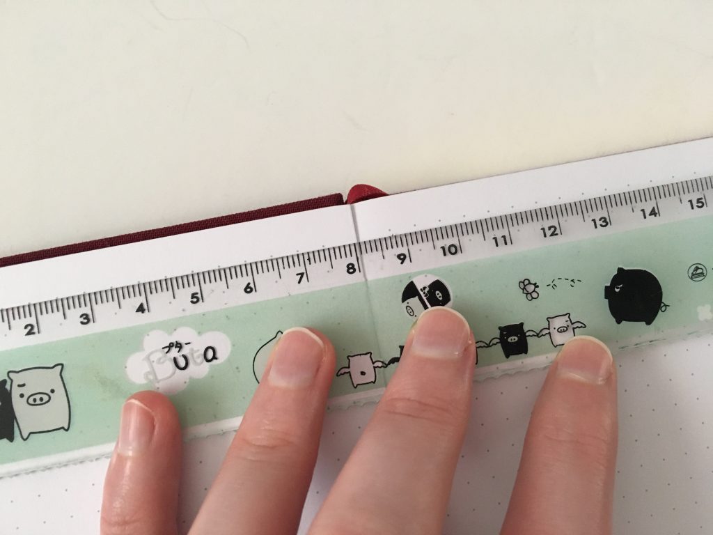
- Poppin ruler
Would I use this spread again?
Yes. Simple, functional and easy to setup. I can see why the Archer and Olive notebooks are so popular – no ghosting or bleed through!
Past weekly spreads
- Converting the Panda Planner daily version into a weekly planner
- Trying out the Happy Planner Dashboard Layout
- Christmas Baubles Themed Weekly Spread in my Custom Agendio Bullet Journal
Planning tips
- Planner Inspiration: 10 Rainbow Weekly Spread Ideas
- Arcing my Plum Paper Planner – everything you need to know if you’d like to try it yourself!
- 10 Reasons why I hate traveler’s notebooks and will never use one
Liked this post? Pin it!