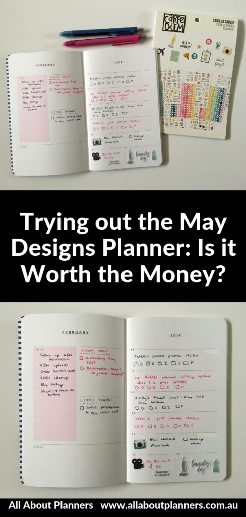
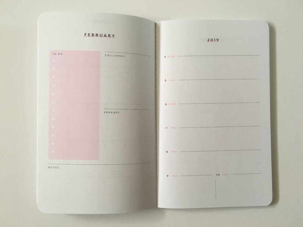
May Designs Blue & Pink Weekly Spread
After finding my weekly spreads getting a bit too same same, I decided to do a 2 color theme this week: pink and navy blue to match the May Designs Planner.
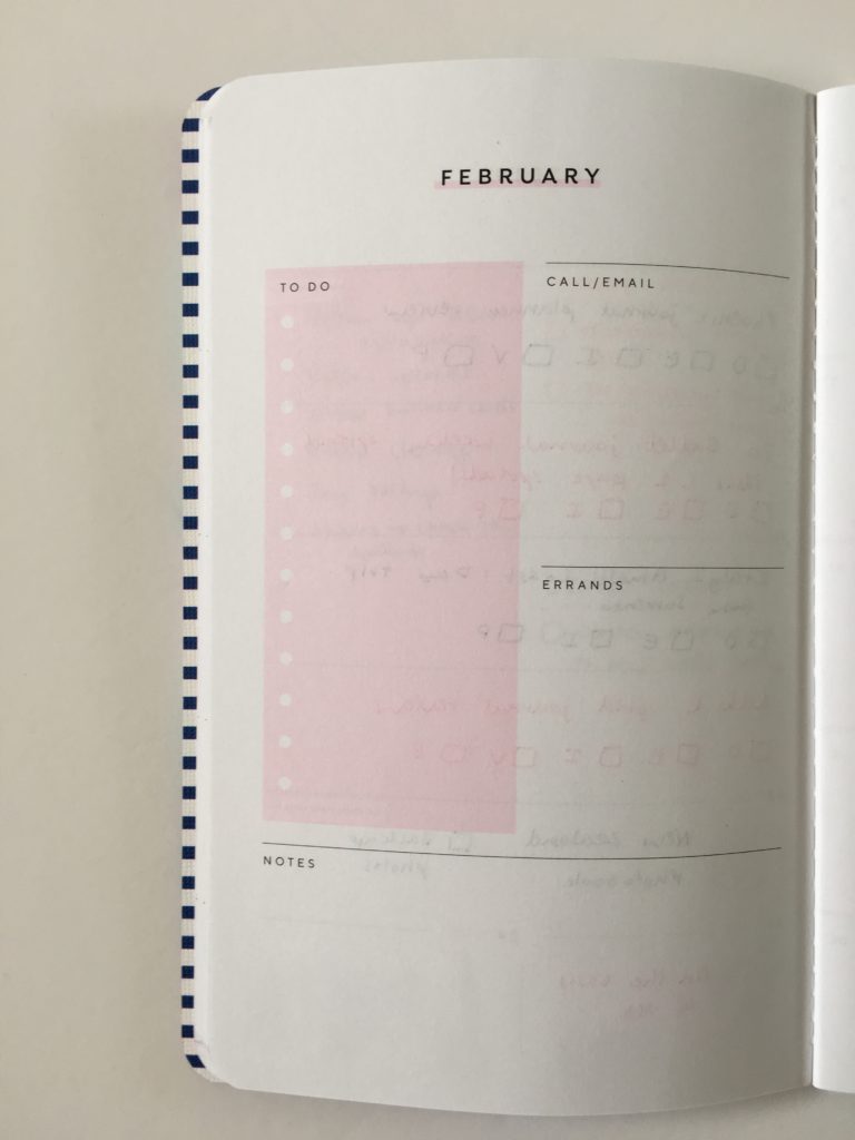
Before the Pen
Related: May Designs Weekly Planner Review
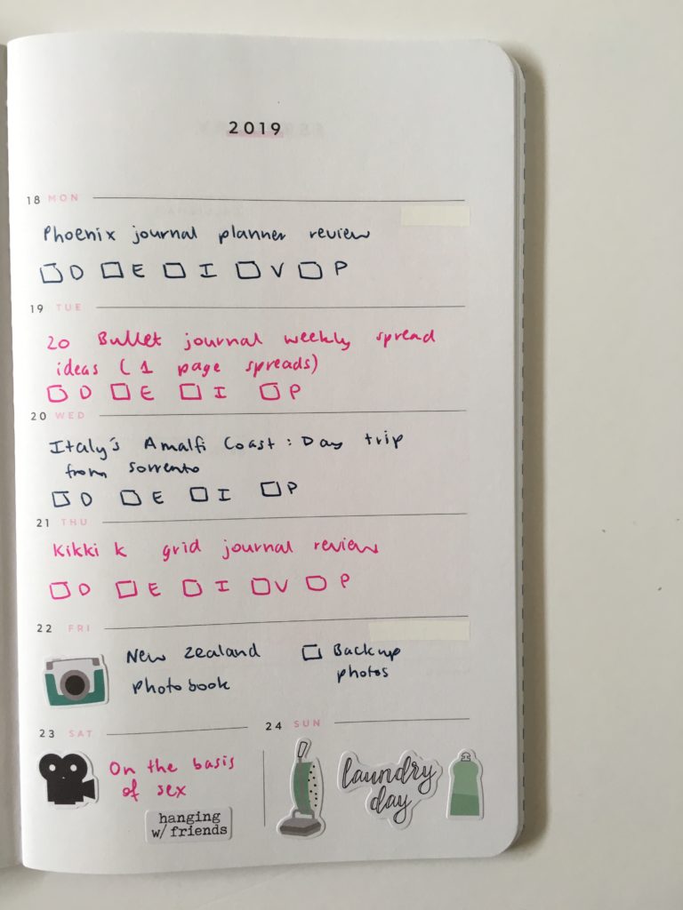
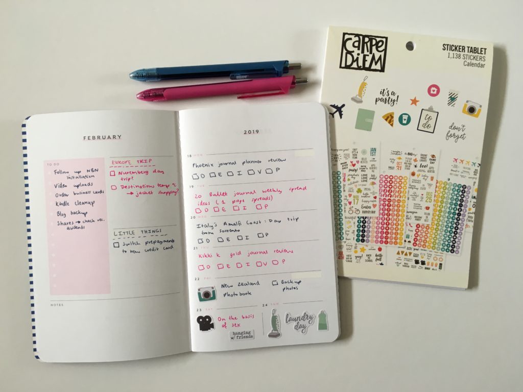
After the Pen
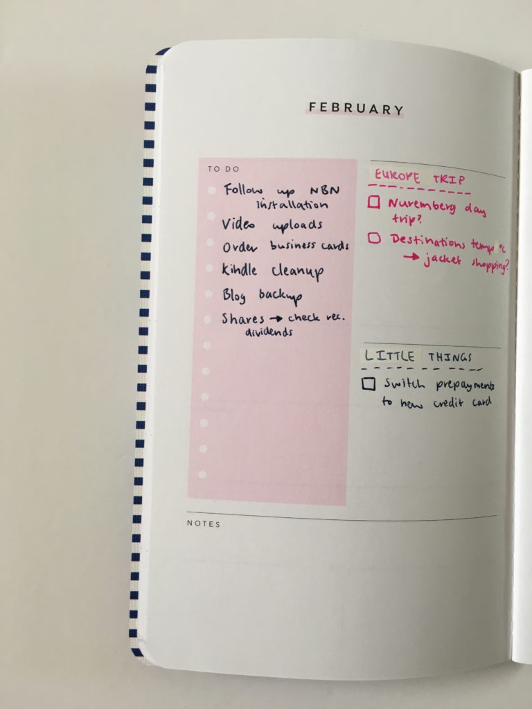
Blog planning (and a bit of personal stuff) on the right and lists on the left.
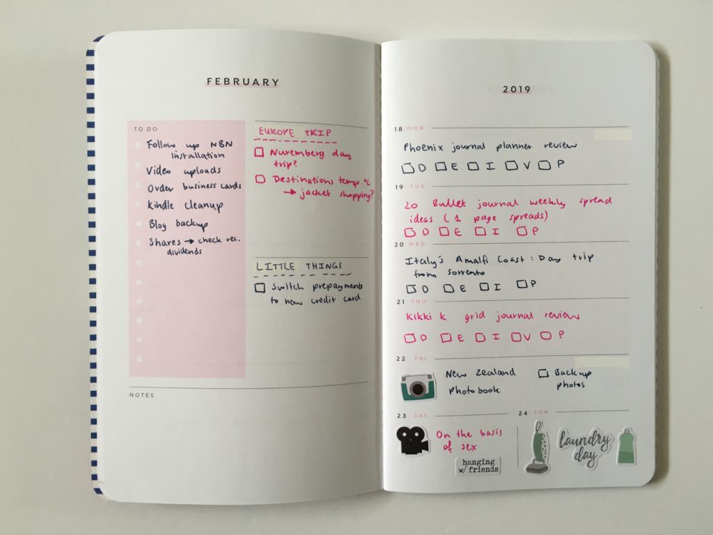
I used whiteout to get rid of the calls / emails and errands headings and changed them to Europe Trip and Little Things.
I really like the Carpe Diem stickers so opted to use those for some quick decorating – they didn’t come in quite the right colors to match the navy blue and pink theme but oh well.
It was a bit squished by the end of the week as I added things to the to do list. The header section of the planner (month and year) is 1.5″ high – it really doesn’t need to be – it wastes space.
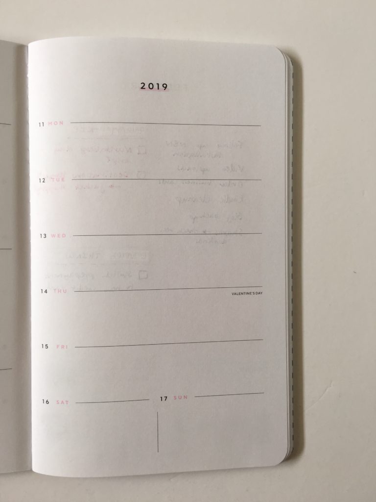
Despite the price of the planner, the paper quality is disappointing. It’s bright white and smooth to write on but the ghosting / bleed through on the back is really bad:
Supplies Used:
- Blot pen (pink and navy blue) – these are almost as good as the Papermate Inkjoy Gel 0.7 (and much cheaper!)
- Carpe Diem stickers (from the ‘calendar’ sticker booklet)
- Officeworks whiteout ($1 for 2 – bargain!)
Would I use the May Designs planner again?
No.
I like the page size – it’s small and portable. I like the weekly layout, everything about it is great. But there’s one major thing stopping me from using this planner again – the price tag. if you’re in the US it’s affordable but international shipping here to Australia is way too expensive.
There are plenty of planners with a similar layout or I could just make a printable or draw up a bullet journal spread. The paper quality of May Designs also isn’t the best. The ghosting on the back is enough that I don’t want to write on the back side of the page because of it.
So yes I would use the weekly layout again but I wouldn’t buy May Designs again.
As for the colors – I do like pink and blue and 2 color themes in general. Definitely need to do a pink and green theme, pink and light blue, pink and orange….
Past weekly spreads
- Using the Planner Pad Weekly Planner
- Planning the week using stamps (MAMBI, Carpe Diem & Creative Devotion)
- 52 Lessons learned after trying 52 different planners in 52 weeks
Liked this post? Pin it!