
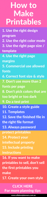
How to make planner printables (advice from a planner addict that’s made over 4000 printables)
I previously shared a post about the Process Behind Making a Printable Planner. Following on from that popular post, here are my 17 tips/piece of advice for making better printables and another sneak peak into my creation process.
Post last updated: January 2025
-
Use the right design program
My preference for making printables is Affinity Publisher. It’s a low cost one time software that combines the best elements of Photoshop and Microsoft Word, with a few extra features that are very handy for making planners (like automatic page numbers!). I like how quick and easy it is to create a design.
Related post: Making printables: 10 Reasons Why I switched from Adobe Photoshop to Affinity Publisher
There are plenty of graphic design programs you can use to make printables apart from Affinity Publisher including:
- Photoshop or Photoshop Elements
- InDesign
- Canva
- Picmonkey
- Google Docs/Excel
- Microsoft Word
- Microsoft Powerpoint
- Microsoft Excel
- Microsoft Publisher
- Apple Pages
- Inkscape
- Etc.
I know a lot of people like to use Canva, but it has a free version for a reason – it has a lot of limitations on what it can and can’t do. The align tools are typically frustrating to use in free software programs, simple & common design elements can be clunky and time consuming to set up, and most have limited fonts. You can access more fonts or access the fonts on your computer e.g. if you’re using a paid font, but typically only on the paid memberships versions of the software. The pro (paid) version of Canva is $165 AUD per year for one user. Affinity Publisher is $96 AUD for a one off payment – NO subscription. So not only does it have far more features for making printables than Canva, it’s far cheaper (Affinity always do a big sale – typically 40 – 50% – for Black Friday too).
Another reason I prefer Affinity Publisher is because I used to making printable and seamless repeating patterns in Photoshop. I liked having everything in the same software suite. Well Affinity is compatible with Adobe. So I can open a file I made in Adobe Photoshop, into Affinity Publisher and the formatting, layers etc, will copy over exactly. Having everything in the same file format makes the design process much quicker.
I’m in the process of doing a comparison / guide with what software I recommend using depending on what you want to make. Click here to subscribe to my mailing list and be notified when the guide is published.
Related post: Making printables in Affinity Publisher: How to set up your document and choose page size
-
Use the right color mode
I did a post explaining graphic design terminology such as RGB vesus CMYK color modes.
Basically, CMYK is for print, RGB is for displaying colors on screen. Use CMYK if you’re going to have your printables professionally printed. Use RGB if you’re going to be making printables that can be printed at home.
I typically use RGB for everything except business cards which I have professionally printed via Vistaprint. When printed the colors vary slightly to how they look when printed using RGB on my home computer. To be honest, I thought CMYK would produce nicer colors and better image quality but I’ve actually found RGB seems to print nicer.
Note that how colors print also depends on what colors you’ve chosen and the brand/spec of your printer. If in doubt, use black and black is black is black!
Related: How to make your own planner stickers: the tools and resources you need
3. Use the right page size/template
US/Letter page size is not the same as A4 page size! Similarly, A5 page size is not the same as what most people refer to as half page size.
Make sure you decide what page size you are going to use for your printables BEFORE you start designing. I live in Australia and we use A4 page size, however, most of my customers live in the USA and use US/Letter page size. While you can still print A4 onto US/Letter page size and vise versa, it will leave extra white space on either side of the page (if printing A4 onto letter size) and extra white space at the bottom (if printing US/Letter size onto A4 page size).
US/Letter page side is shorter and wider than A4 page size.
If you’re not sure what the dimensions are for a certain page size, I recommend this website (extracts below).
USA page sizes
Half a US/Letter page size is often referred to as ‘half page size.’ this is NOT the same as A5 page size (see below).

A4 Page Sizes
Australia and the UK use A4 page size. Half of an A4 page is A5 page size.
4. Use the right page margins
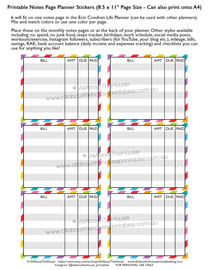
Some printers can print right to the edge of the page (borderless printing), and others can’t. If a printer can do bordereless printing and your designs are intended for borderless printing (like my printables are) then make sure you allow enough margin for hole punching, if a customer wants to have the printables bound to create their own notebook, of if they’re using the Arc Planner System (which is what I prefer to use).
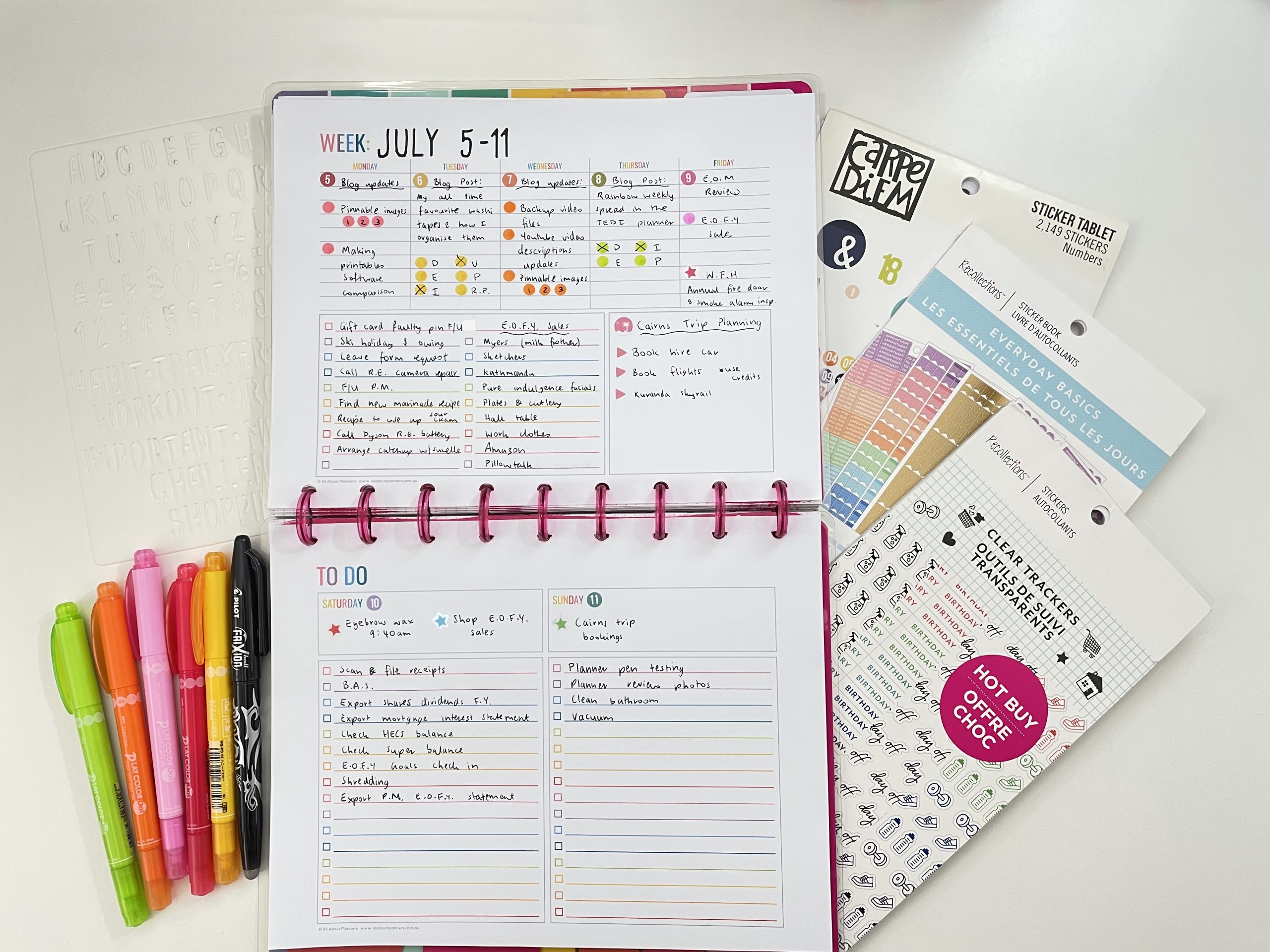
You may also want to allow a larger margin on the inner border of the pages. For example, in the printable below (which is half letter size when the page is cut in half), I left a larger margin on the inner side of each page (i.e on either side of the grey cut line) so people aren’t writing on their binder rings or the spiral coil (especially annoying for left-handed people!)
I typically allow a minimum of 0.25” around all sides of the page for half letter size and A5 page size, and 0.5” margin for A4 and letter/US page size (full page size). To increase the efficiency of the design process, I create a template once that includes margin markers and my copyright notice at the bottom of the page.
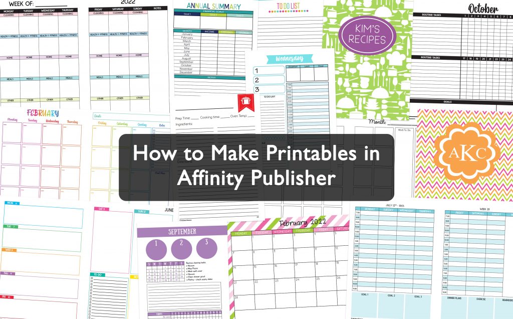
If you’re interested in more tutorials about making your own printables, I have an entire ecourse filled with step by step video tutorials: How to make printables in Affinity Publisher

5. Make sure you’re using commercial use allowed fonts
There are so many wonderful sites you can find free commercial use fonts. I previously shared a list of my favorite font resources.
Make sure that commercial use is allowed before creating your design, and if a donation is required, you DO need to donate. If a font is paid and you don’t want to pay the price then keep looking. How would you like it if someone stole your hard work without paying for it?
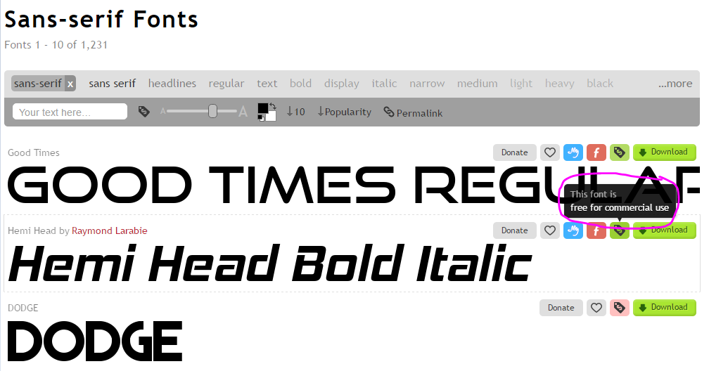
If you’re not sure if a font is allowed to be used for commercial use, there is usually text near the download button (as is the case on DaFont), otherwise, there’s usually a symbol telling you if commercial use is allowed. The screenshot below is from Font Squirrel. The green price tag icon means commercial use is allowed but red means personal use only. Most sites will allow you to filter font search results to show only ‘commercail use allowed.’
Note: the meaning of ‘commercial use’ can vary between websites – make sure you read the terms of use (they’re usually included in a text file along with the font download), before using them in your designs.
6. Correct font size & style
Make sure the font size is large enough to read and choose a font style that is easy to read. Cursive fonts have a time and a place. They are good for headings (I use a cursive font for the headings/titles of my planner pages) but I don’t recommend using them in the body of the text on the page.
There are hundreds of thousands of fonts out there and it can certainly be overwhelming! Most sites will allow you to filter the fonts by type e.g. ‘cursive’ and ‘sans serif’ (what I refer to as simple/block font style).
7. Don’t use more than 2 fonts per page
Don’t give so many options that your customers end up with analysis paralysis – you don’t need to offer the same design in 50 different fonts. Remember that people will only see the 1 or 2 fonts you chose, not the 50 other font options. Most of the time people are happy with the font you’ve chosen and I’ve found, from my own experience, that when I offered multiple font choices 9 times out of 10, customers would request the font as shown in the sample.
![]()
8. Don’t pick colors that are too bright or too dark
My favorite color schemes are ‘Pantone solid coated’ and ‘TOYO 94 Color finder series’ in Photoshop (see below). More on how to use Photoshops color menu in this post.

If you pick neon colors you might turn some people off, if you pick colors that are too dark, you might turn some people off. You always want to try and choose a color that is in the middle of the color wheel for that shade.
You also want to make your printables ink friendly – don’t do big blobs of color just for the sake of it. Try and stick to one element that is colored that is the ‘feature’ of the page e.g. colored font. You don’t want it to look like a box of crayolas threw up all over it!
Related post: My 5 Favourite Color Tools for Graphic Design
9. Do a test print
What you see on screen isn’t always what you see on paper. Printing out a design and having it physically on front of you really does make a huge difference. It can point out elements of your design you may not have noticed before. You may also realise that maybe that font size needs to be increased, or that line spacing isn’t far enough apart etc.
There’s nothing worse than creating a dated calendar/planner when all the dates are wrong, or you have a typo. And if you don’t see it your customers certainly will!
Colors that look nice on screen can look dull when printed and vise versa. That is where a style guide comes in handy…
Related post: Printing Tips
10. Create a style guide
Once you have a page layout/template set up, you’ve done a test print and you’re happy with it, it’s time to create a style guide!
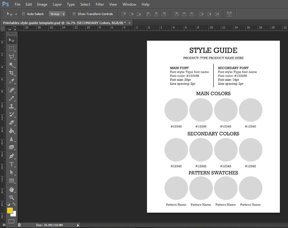
This is my blank/ready-to-use style guide template that I use each time I create a new color scheme or a new planner range.
The main things you’ll want to include in your style guide:
- Font style
- Font size
- Font color
- Line spacing
- The main colors in the collection/used in the printable (I don’t recommend using more than 4 colors unless you are doing a rainbow color scheme)
- Secondary colors (if applicable)
- Pattern swatches (I take the pattern overlay and use a clipping mask to place it above the circle. This is great to see how multi-colored patterns and patterns that use more than one color match with the other colors in the collection.
If you’re wondering why I bother making a style guide there’s a few reasons:
- It takes 5 minutes flat once I’ve made the color choices
- I like to print the style guide out and place it above my workspace, then refer to it when I’m designing
- If I’m doing a rainbow color scheme, I like to have the style guide template open in a new file in Photoshop while I’m designing, that way I can just swap between the files and use the color picker tool. Much quicker than typing in the color codes
- If the product line only has one or 2 colors then I find it’s usually quicker to just glance at the printed style guide above my desk
- If I decide to use a color scheme at a later date, I can simply open up the style guide and I’m good to go
- Trying to remember the RGB and 6 digit HEX color codes is brain-space not worth wasting!
11. Templates
Once you’ve created a printable design that you like, save a copy as a template that you can refer back to later. Make sure you back the template up on a cloud storage (I use Backblaze) and/or an external hard drive. I always label the template file the name of the printable followed by the word: ‘template’ that way I can easily locate the file by searching the thousands of files on my laptop.
Templates are the reason I’m able to make so many printables in such a short amount of time.
12. Save the finished file in the right file format
PDF file format is the most common file format for printables. You can also do JPG (image) file format which compresses/merges all of the layers into one image. Some customers have told me they have issues printing JPG files at home. Most office supply stores prefer PDF and if you offer PDF file format you can include multiple pages in the one PDF file which you can’t do with a JPG file.
I use and recommend PDF file format for planner printables. I offer both JPG and PDF file format for my printable planner stickers, as people can use the JPG file in Silhouette Studio to cut out the stickers.
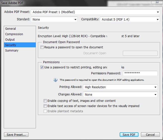
13. Always password protect your printables
Make sure you set a password (that’s not something easy to crack like ‘123’)
How to password protect a PDF:
After converting to PDF file format from whatever software you’re using, go to file, save as > reader extended PDF > and add a password. The only thing I let people do is print the pages (make sure you select highest print quality resolution).
Just make sure you don’t accidentally tick the box beside ‘require a passord to open the document’
14. Protect your intellectual property
Add a copyright notice at the bottom of every single printable. If people ask you to remove this I have no qualms about saying no. The printables are my design, of course I’m not going to remove the copyright notice so they can rip off my designs!
For my copyright I put © All About Planners ETSY SHOP URL and blog URL as well as ‘FOR PERSONAL USE ONLY’
(my old shop name used to be All About The House)
Example:
You can add extra text into your disclaimer if you want such as:
Not to be copied, distributed, altered, sold, shared, given away for free, hosted on your blog or claimed as your own.
15. Include printing instructions
Especially if assembly is required. Even if it seems obvious to you a few simple steps could make a customer like your template more if it’s user friendly, and also saves you having to go back and forth answering questions. If it takes too long to assemble the printable, then customers will associate your product with a negative experience and may not buy from your store again.
 I also like to include tips about page size and paper weight. if you’re interested you can read more about that in my printing tips blog post.
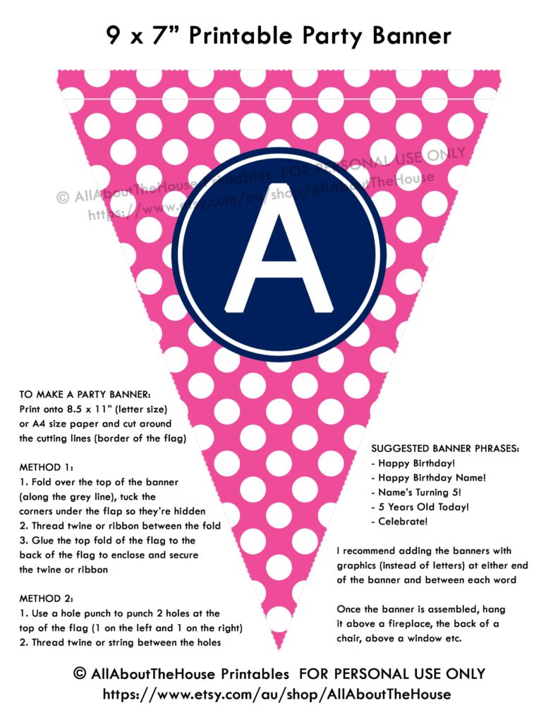
The other thing you should include are suggested uses (particularly in your product descriptions if you choose to sell your printables). For the banner example above, I mention that you can use twine to create the banner, or string, ribbon etc. and that it could be placed in various locations such as the back of a chair, along a porch railing, above the fireplace etc.
If the design prints best on non-standard type paper such as sticker paper that the customer is not likely to have on hand, then make sure you provide suggestions on your favorite sticker paper type and where they can purchase it from.
If you do sell printables you WILL get asked questions about how this and that works. Try not to get frustrated with non-tech savvy people – remember that you were one of them once! Having a detailed FAQ page also helps 🙂
With that being said, here is a link to my FAQ page with printing tips.
Related: How to make a party banner in Photoshop (How to make party printables), DIY
16. If you want to make printables to sell, the first printables you make probably shouldn’t see the light of day
The first printables I made were awful! So embarrassing looking back at them now. I remembered thinking how awesome I thought they were back when I first created them and then not long ago I stumbled across a file I made years ago and cringed then pressed the delete button!
Take the time to experiment with different colors and layouts, because if you’re going to be creating an entire product line of printables or an entire planner, there’s a lot of work involved (more than you probably realise) so make sure you are 100% happy with all of the design elements of the printable.
17. Create your own style
Put your own spin on it. I’ve had numerous many people try and knock off my designs. Legal cases for copyright infringement are quite expensive and time consuming for both parties. There are so many different layouts you could use for your printables, so many different ways of doing things I cannot fathom how people feel the need to copy what other’s have already created when there are so many more ideas to be had!
Plus it’s boring when everyone has the same thing. Shops that do well selling printable are ones that have their own unique, distinctive design. If you look like all the rest your only advantage is to compete on price (and that’s a race to the bottom i.e. zero profit) and your shop won’t be memorable. Instead, do something different, something that will set your printables apart from the rest.
I hope you found these tips helpful!
How to make printables in Affinity Publisher ecourse
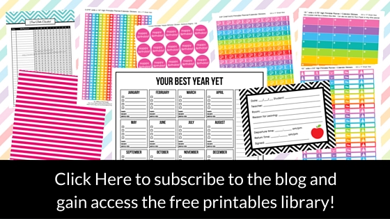
Not interested in learning how to make printables and just want to download some free printables to try? Subscribe to the blog – you’ll also gain access to the free printables library 🙂
Found this post helpful? Pin it!

One Comment