
7 Tips for creating rainbow themed spreads in your planner or bullet journal
I like my weekly spreads to incorporate color. While I typically gravitate towards the same rainbow color scheme, I do sometimes mix it up.
If you want to add more color into your planner, here are some tips for how many colors you should include, how / why I order the colors in a specific way, some things to avoid, as well as some example color pairings you could use in your next weekly spread.
Using colors in your planner or bullet journal
My favorite way to incorporate multiple colors is via the below methods BUT not all at once in the same spread:
- Washi tape (especially borders at the top or sides of the page)
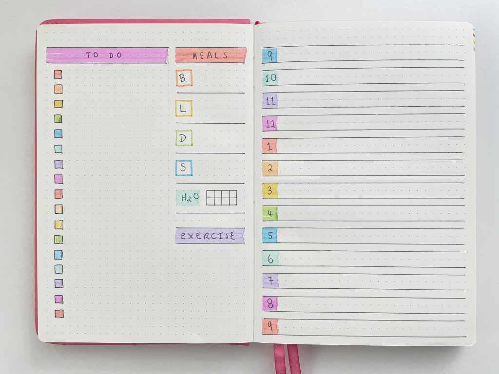
- Checklists (particularly using dot markers, drawing rainbow checklist boxes using pen, or by using planner stickers)
- Highlighters (especially over the top of headings)
- Writing headings in rainbow pen
- Underlining headings in different colors
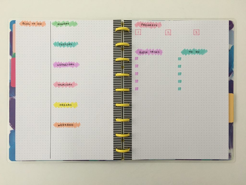
- Simple box stickers (e.g. rectangle boxes), then writing the heading on top of the sticker (e.g. the day of the week)
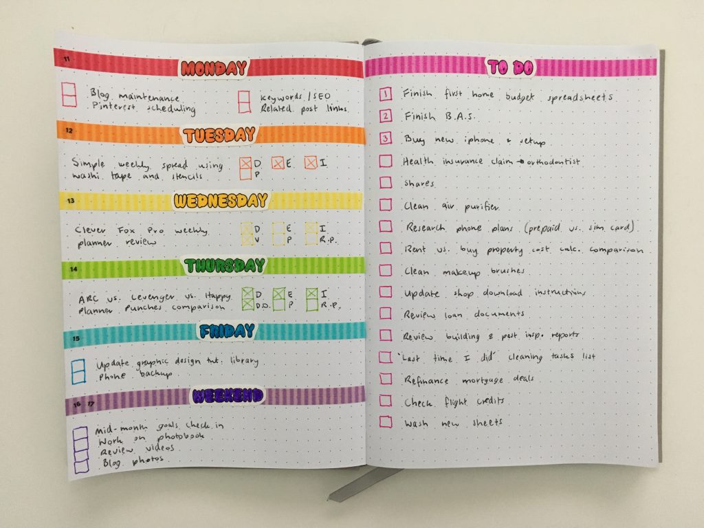
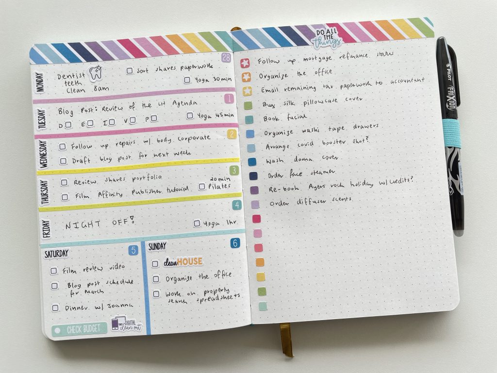
![]()
Whistle and Birch Rainbow Weekly Spread using the Zebra Mildliners
Should you color code?
I used to always color code my planner. I would use red for urgent tasks, pink for blog post planning etc. However over the years I’ve stopped trying to plan everything all at once on my weekly spreads. I now keep the bulk of my blog post planning in spreadsheets, and mainly gravitate towards categorised checklists (which means I don’t really need to color code).
In this post I’m mainly focusing on adding color for decorative purposes. If you want tips for color coding your planner for functional purposes, see these posts:
- How to color code bill paying in your planner (7 different ways)
- How to do color coded weekly meal planning in less than 5 minutes using sticky notes
- 6 Ways to color code your planner to increase productivity
- Color coding your planner: how to choose which colors to use
- How to color code your planner for school using pens
![]()
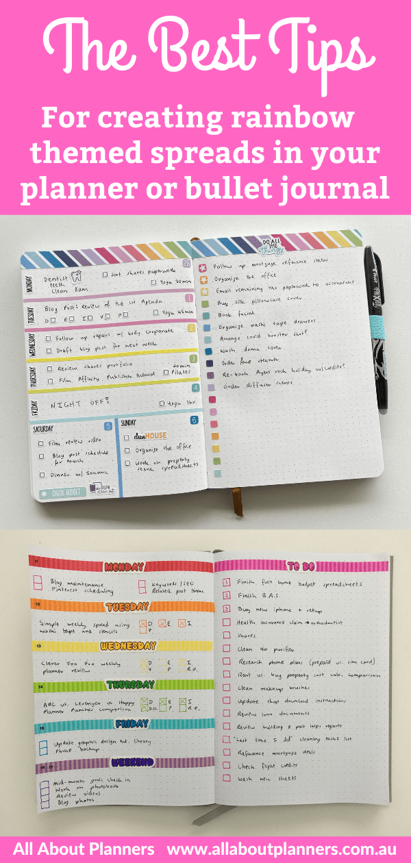
1. What order should you arrange the colors?
You’ve probably heard the saying ROYGBIV to remember the colors and order of the rainbow. I tend to start with this as a guide but do switch it up every now and then – red, orange, yellow, green, blue, indigo, violet (I usually replace indigo with pink)
I avoid pairing red and green together in the rainbow order as it makes me think of Christmas colors.
2. Avoid yellow
I usually pair red together with orange and yellow. If I don’t need all 7 rainbow colors, yellow is the first to go, usually followed by orange, then red.
Since I like orange and yellow the least, I order these colors last, then if there’s repetition on say a checklist in my bullet journal, and I don’t have enough room to repeat the entire color order, then the colors I prefer will appear on the page the most.
It’s also hard to find a decent pen with yellow ink you can actually see!
Related post: Yellow pen swatches (and my recommended pens that have yellow ink you can actually see)
Notice how I used yellow and orange far less than the other colors in these spreads?
…and how much better they look than this spread where I used too much yellow.
![]()
Bullet journaling with planner stickers in the Happy Notes Book
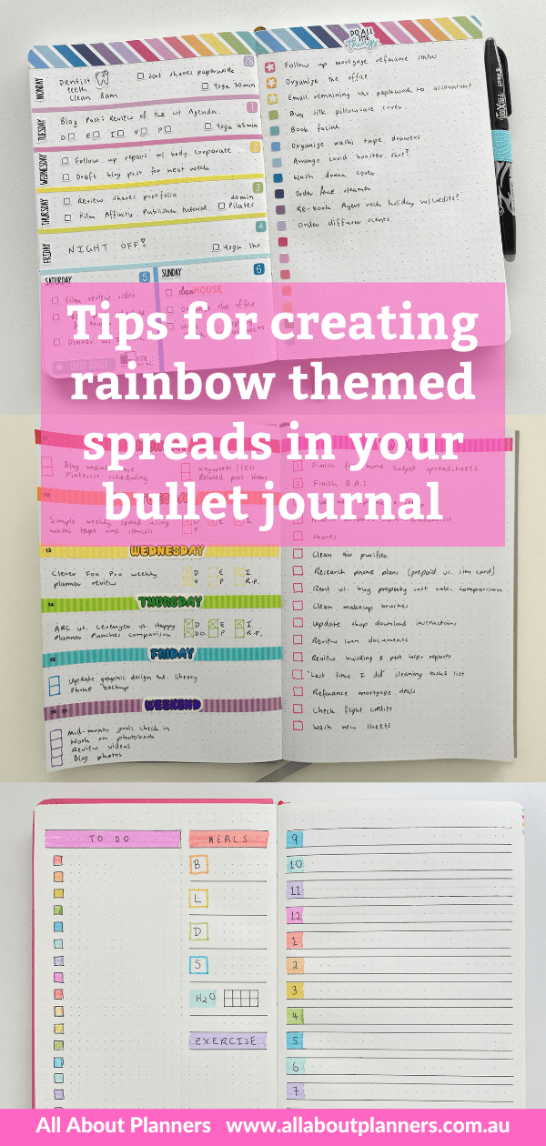
3. Experiment with the order of the colors & do a pen test
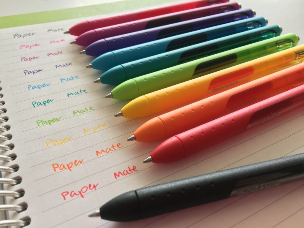
I experiment with the order of the rainbow colors first. I usually do some pen scribbles / swatches on a scrap piece of paper to see how well the colors pair together, before I create the final spread in my bullet journal. If you switch between stationery brands often (like I do), don’t skip this step as sometimes the color of the pen body doesn’t actually match the color of the pen or highlighter ink (e.g. a medium shade of green pen body but then the ink comes out dark green).
Once you decide on a color order, lay out the pens, highlighters or whatever else you’re using in the order you’re going to use them in. Then you don’t have to think about which color you’re picking up next, you just follow the color order.
Someone once commented saying they thought this photo was a paid brand deal with Paper Mate (I wish!). No, this is actually how I lay out my pens and decide the order of my color schemes before I start drawing up a spread or writing in a planner. I really helps to see how the different ink colors looks, not just the pen body colors.
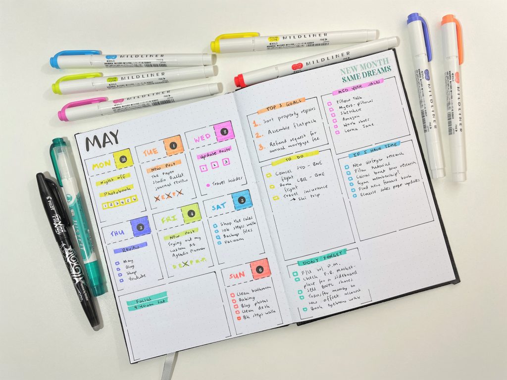
For reference, I created this spread back in 2017. I didn’t plan what color order I was going to do, I just chose colors randomly – this is why the rainbow doesn’t look as nice!
![]() Colorful Bullet Journal Inspired Weekly Spread
Colorful Bullet Journal Inspired Weekly Spread
4. Match the colors of the washi tape or other planner supplies
If I’m taking inspiration from a rainbow washi tape (usually rainbow stripes or polka dots), I will try and match the colors of the washi tape as close as possible. I’ll also follow the same color order as the washi tape. This is why I love when brands have coordinating planner supplies, it makes it very fast and easy to create a pretty spread.
There are multiple shades of blue in this washi tape, so I started the divider lines on the left page in purple, then followed the color order. Since I didn’t have enough divider lines to include red, I started with red as the first checkbox on the right page.
Rainbow weekly spread using Planner Kate stickers
5. Match the colors of the planner
I also take inspiration from the colors of the planner pages or the inserts I’m using.
6. Reverse the rainbow
So whatever colors you started with to write say, the month or week at the top of the page. You should reverse those colors when writing the days of the week. Then by flipping the colors you won’t have that same colors close to each other on the page. I.e. If you started using green to write the month at the top of the page, then I would make green be the color I use for the last day of the week.
For this spread I started with gold, purple and orange on the left page, and didn’t repeat those colors again until the right page.
I started on the left page with yellow and orange (rare design choice for me!) plus pink, and repeated those colors again (in much the same order), on the right page.
I usually avoid dark green. There’s just something about that shade of green, it just doesn’t look that great with other colors.
Example color pairings
If you need ideas for rainbow color pairings, see the list below for examples. It might help to consult a color wheel and do a quick Google on Color theory (look up ‘warm tones’ and ‘cool tones’).
- Pink, purple, green
- Pink, purple, green, blue
- Pink, purple, green, blue, purple
- Pink, purple, green, blue, purple, pink
- Pink, purple, blue, red
- Pink, orange, green
- Pink, orange, purple, green
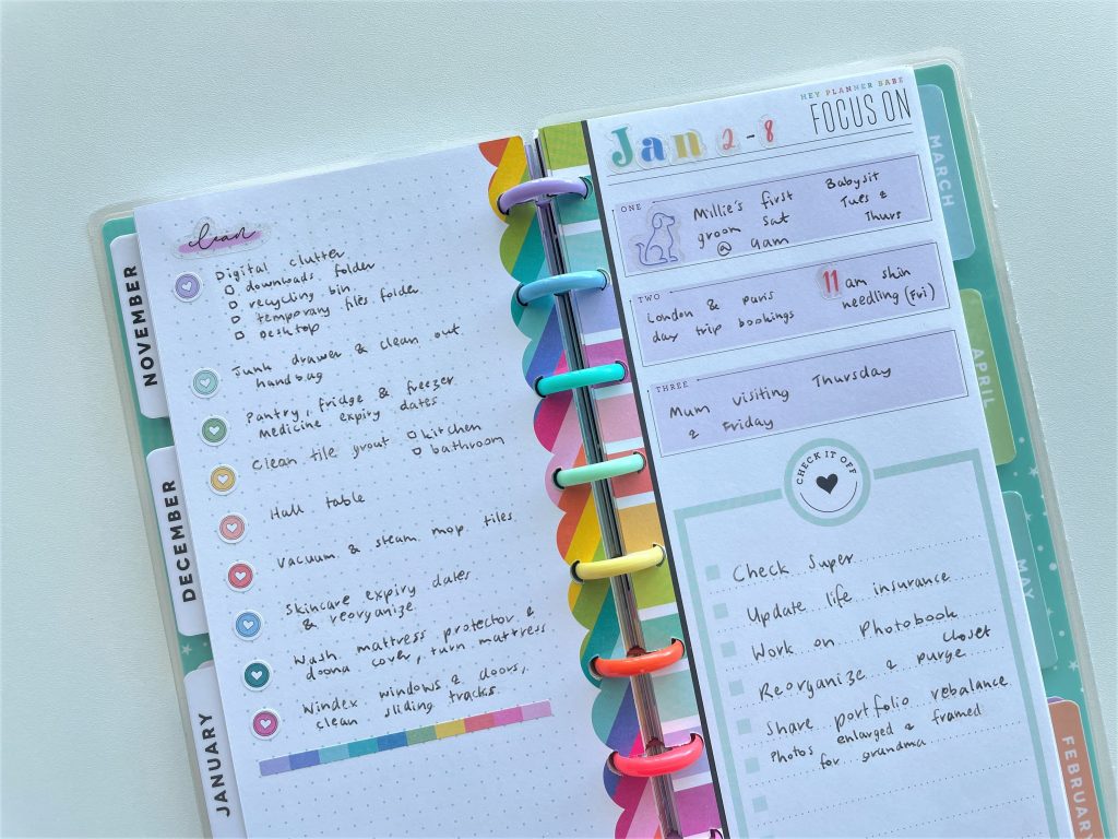
Resizing printables to A5 page size for a rainbow weekly spread in my ARC
If you have planner stickers in multiple shades of each color, you could get away with only using 2 colors like I did here:
 Using Erin Condren Size Planner Stickers in MAMBI Classic Happy Planner
7. How much color is too much?
Unless you have a lot of space to incorporate many colors, I’d stick to no more than four colors with a few exceptions:
- If you’re using a different color for each day
- If you’re color coding your planner (but that’s a whole other story – see this post).
I used to write tasks and just about anything / everything in rainbow colored pens in my planner, but have decided it makes the pages too ‘busy’. Nowadays, I usually just do a rainbow checklist or write the title in rainbow (sometimes different colors for each letter), and then write all my tasks, notes, reminders, appointments and anything else in black pen (Pilot Frixion Erasable).
If you’re using dot markers to create checklists, you can cross though the circle, or draw a black outline around the dot when the task is done.
Read more: 7 ways to use dot markers in your planner spreads or bullet journal
Related posts:
- 10 Rainbow weekly spread ideas
- My Top 10 Favorite Weekly Planners (after reviewing more than 200 planners)
- 52 Lessons learned after trying 52 different planners in 52 weeks
Found this post helpful? Pin it!
All these colours make me happy! I’m going to try the boxed version for next week, thanks for the idea.